[yimumu]We are an international design agency. With design, we pave the way for European companies to enter the Asian market and Chinese companies to access Europe.
DOWN
Bioeast Web Design

TASK

Business website was redesigned to match the brand upgrade.
Assisting the brand to establish its image in the domestic industry, open flagship stores, and launch international markets.

  • Define personalized brand online promotion

  • Cultivate a corporate identity defined by professionalism, integrity, innovative vitality and dynamic energy

SERVICES

  • Explore the design language that fits the corporate image

  • Innovative brand visual positioning

  • User research and needs analysis

  • Responsive framework structure

  • Visual interactive design

  • Continuous support for the implementation process

DIRECTION

What does Bioeast hope its website will be like?
To find the answer, we conducted in-depth research and competitor analysis on Bioeast.

Identity

Distinct corporate image

Demonstrate the group's distinct image and high reliability and recognition within the same industry. Enhance the brand image of professionalism, vitality and innovation.

Creativity

Innovative, flexible, energetic, young

Reflect industry innovation in UX, present content as professional and reliable, and emphasize brand image through design that is bold, vibrant, and full of vitality.

Connectivity

Clear information delivery, flexible connection

Clear and easy-to-understand business and product introductions as well as flexible and quick ways to contact them. Flexible page redirection and cross-terminal switching to enhance the user experience.

Keywords

We are familiar with the brand positioning of Bioeast and define the key visual information of its brand.

We hope to deliver brand information to the outside world in a higher quality.

#Innovative, youthful, vibrant #Professional, reliable, trustworthy #Clear business introductions, convenient and quick access
to product information for searching and saving
#Position in the industry and future prospects #Website technical means are more in line with modern trends
Spirit
Professional
Future
Matchless

PROPOSAL

UX Strategy + UI Concept

Based on the previously derived strategy, explore how to enhance the brand image through
visual representation and interactive means, and convey brand information persuasively.

Grid System

A grid system was created to adjust and optimize the interface according to the different
resolutions of various terminals, and make the layout of interface elements more
organized. This also serves as the foundation for interface design layout.

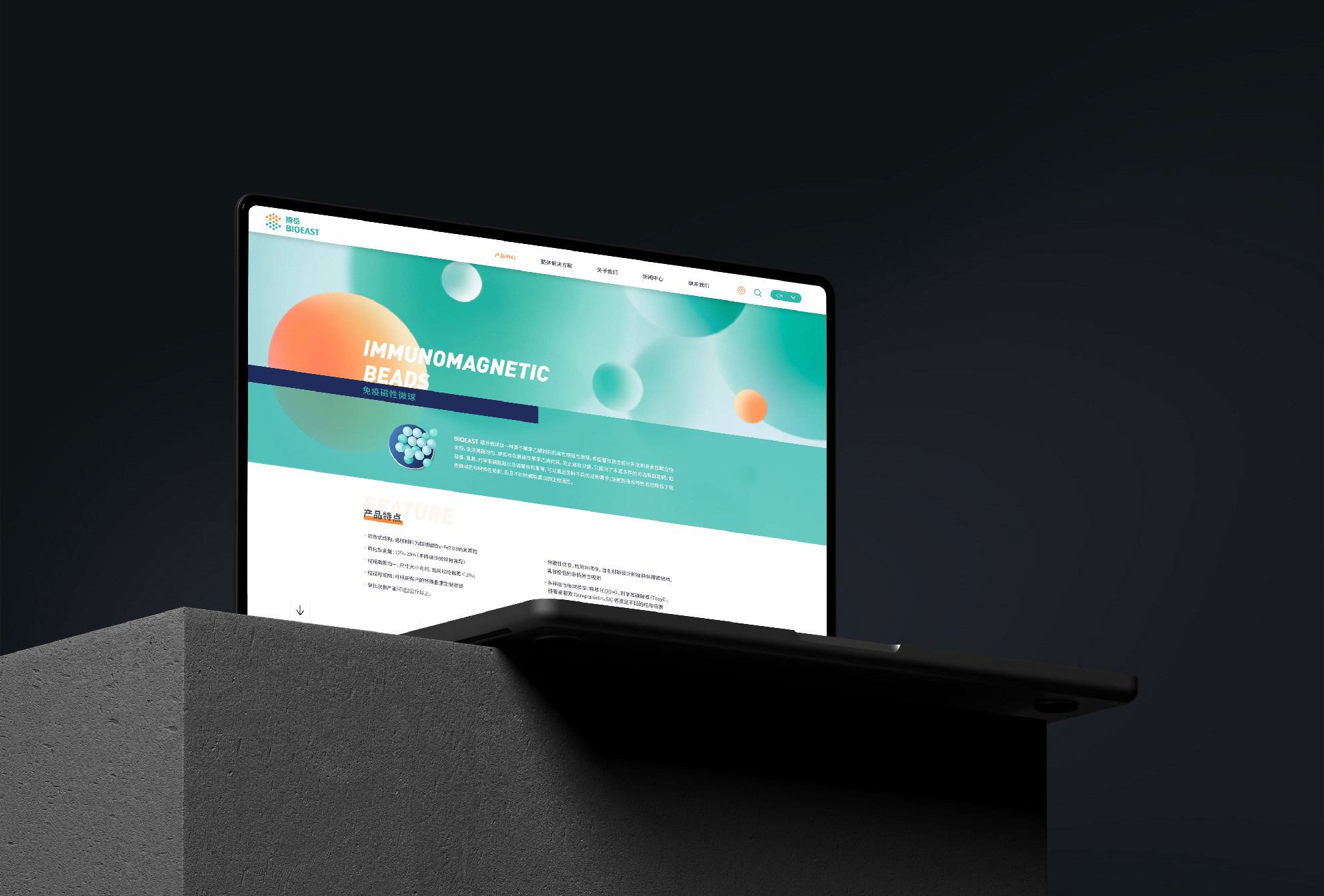
Create a grid in the background of the Bioeast website, combining Bioeast's brand visual elements and image.
In the application design of the pages, a well-organized grid layout and moderate and effective interactions are
implemented, which further enhance the brand's distinct visual image and brand identity value.
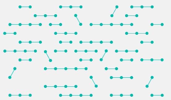
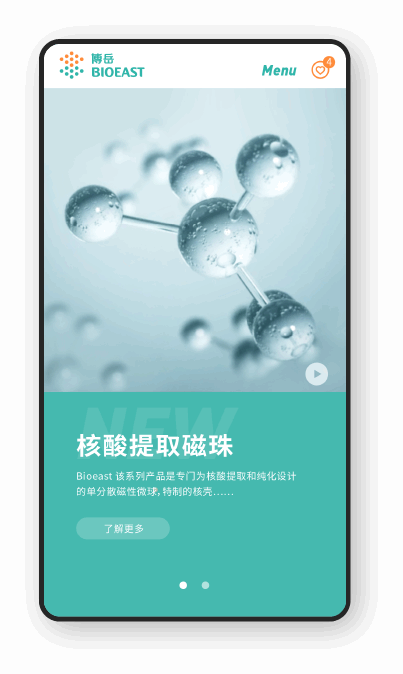
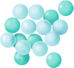
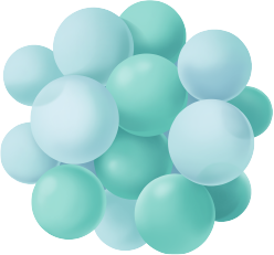
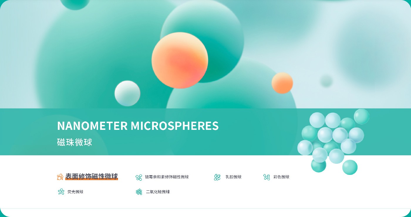
Circle Graphic

We highlighted the use of the brand's representative element, the circle, on the website.
The brand image is continously reinforced in multiple ways.
Through graphic patterns combining circles and lines on the homepage and first level
menu sections, the website vividly convey the corporate attributes.
Furthermore, graphic motion showcases the corporate attributes and image positioning,
constantly transmitting the brand's innovative and youthful atmosphere.

graphic pattern v1

graphic pattern v2

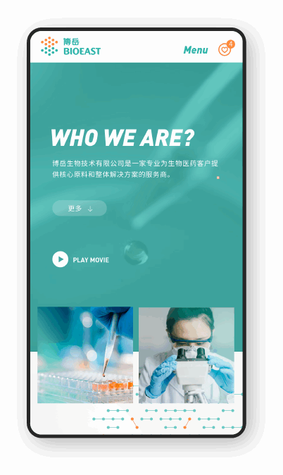
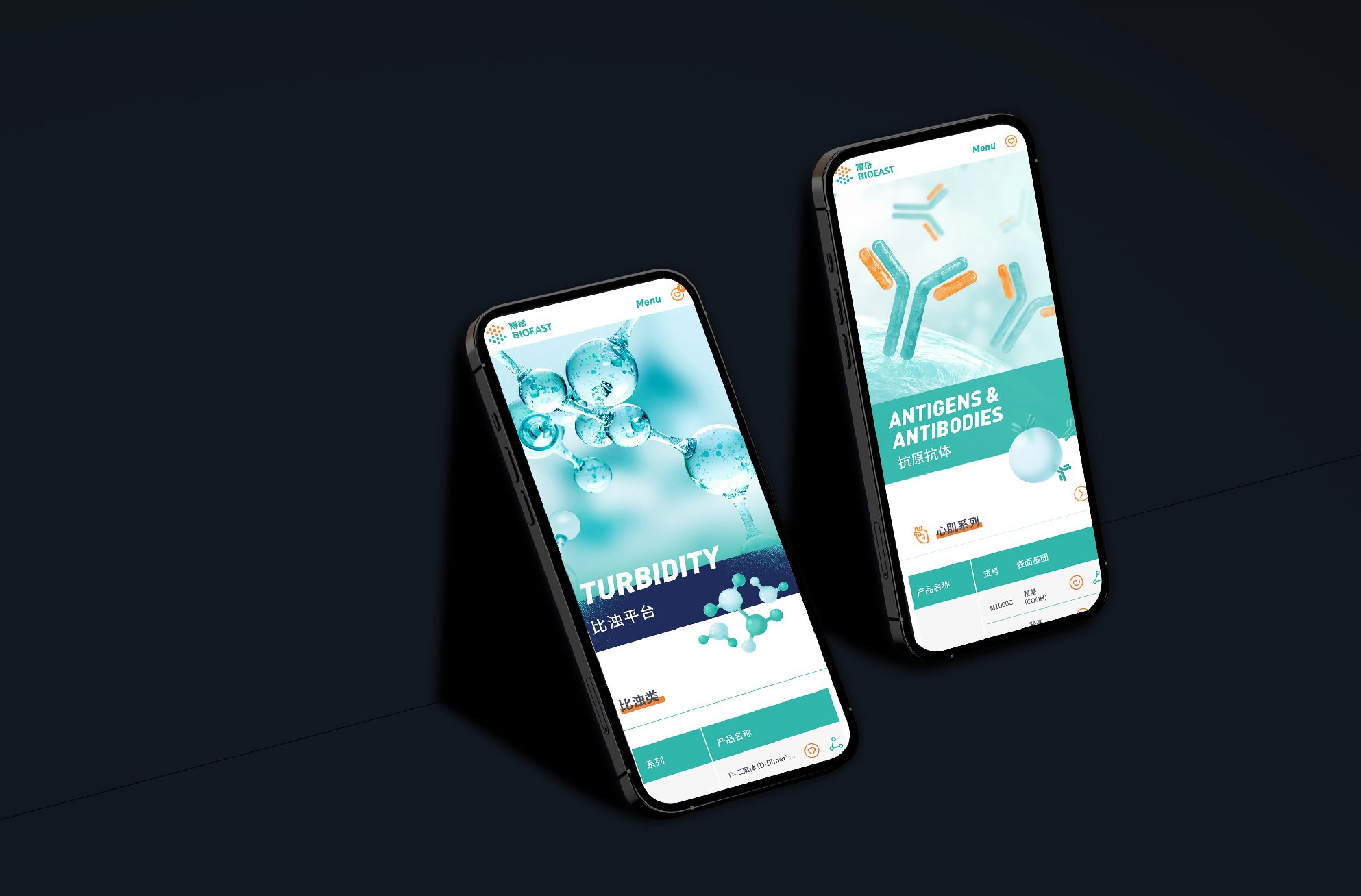
Interaction & Image & Video

We will display Bioeast's products in the form of high-definition large images, videos,and
animations, aiming to create a stronger visual impact to highlight Bioeast's unique image.
Meanwhile, the intuitive visual effects are more in line with modern interactive visual
aesthetics, clearly conveying the product and corporate image.

Continuation

In the structural design of the product center for Bioeast, we continuously discuss and optimize
with clients through navigation, product classification, search functions, etc.
This enables everyone to effectively find the corresponding products and also
allows them to bookmark products and conduct timely customer visits.

Branding Colours

Extensive use of colours to continuously reinforce the brand, and at the same
time make the entire interface more in line with modern trends.

#00b8aa
branding color
#ff8c3b
branding color
font color
background

Iconography

The three-dimensional icons for different product categories, as well as the
linear icons, are all closely related to the brand-supporting circles.

3D product icon system

Line style icon system

Launched

Resposive Web Design

The Bioeast website is designed as a responsive website, aiming to ensure a consistent browsing experience in various environments.
Meanwhile, consistent imagery and layout concepts are used to maintain visual consistency in the design,
providing a unified brand image for users browsing on different terminals.

More ideal keyword optimization techniques

Let more people get to know Bioeast

yimumu

Helped medical diagnostic instruments win the iF Design Award

yimumu

Helped medical diagnostic instruments win the iF Design Award

yimumu design & consulting GmbH

Dentenbergstrasse 76, 3076 Worb, Switzerland

  • Yi Salomo

    Legally represented by its Managing Director

  • Handelsregister Bern, CH-036.4.077.565-9

    Company Registration Number

  • yi.salomo@yimumu.com

    E-Mail

  • CHE-319.686.056

    UID/MWST in Switzerland

Zybio MEDLAB Dubai Booth Design